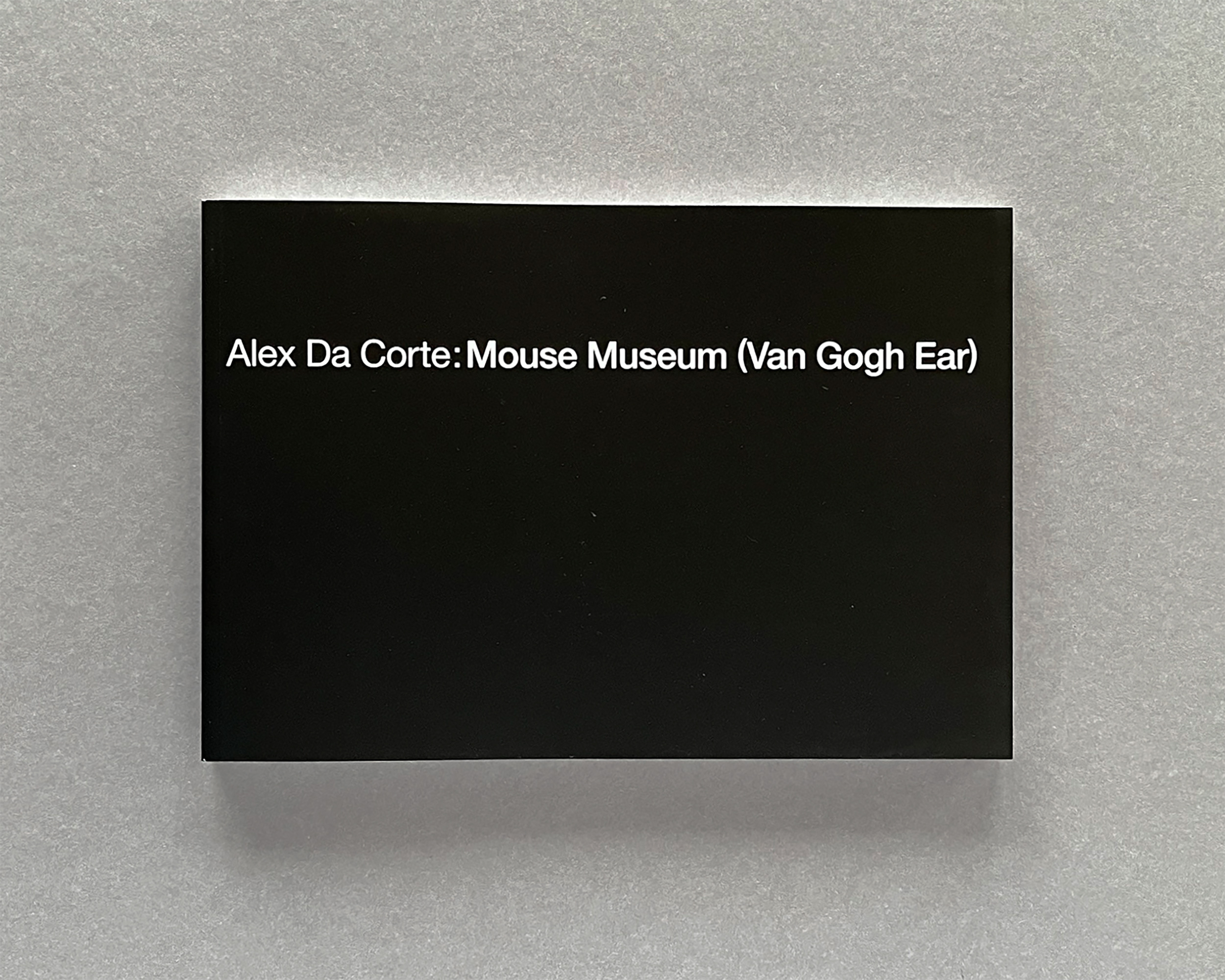
The close of 2024 feels like the right moment to look at a project that embraced what complex cultural work actually requires. The Mouse Museum book, created with William Pym and Alex Da Corte, took two years - spanning three languages and multiple institutions, with the 1979 Ludwig/Rijksmuseum publication as our north star. Not a reproduction, but a conceptual bridge that simply required time, precision, and attention. The craft mattered. The details mattered.
When Will, the managing director for artist Alex Da Corte and long time friend and collaborator, approached me about designing a book that would serve as both documentation of an exhibition and a conceptual artwork in itself, I knew we were in for an interesting challenge. The project: create a precise copy of a 1979 Ludwig/Rijksmuseum publication, but with entirely new content. Simple enough on paper, considerably more complex in practice.
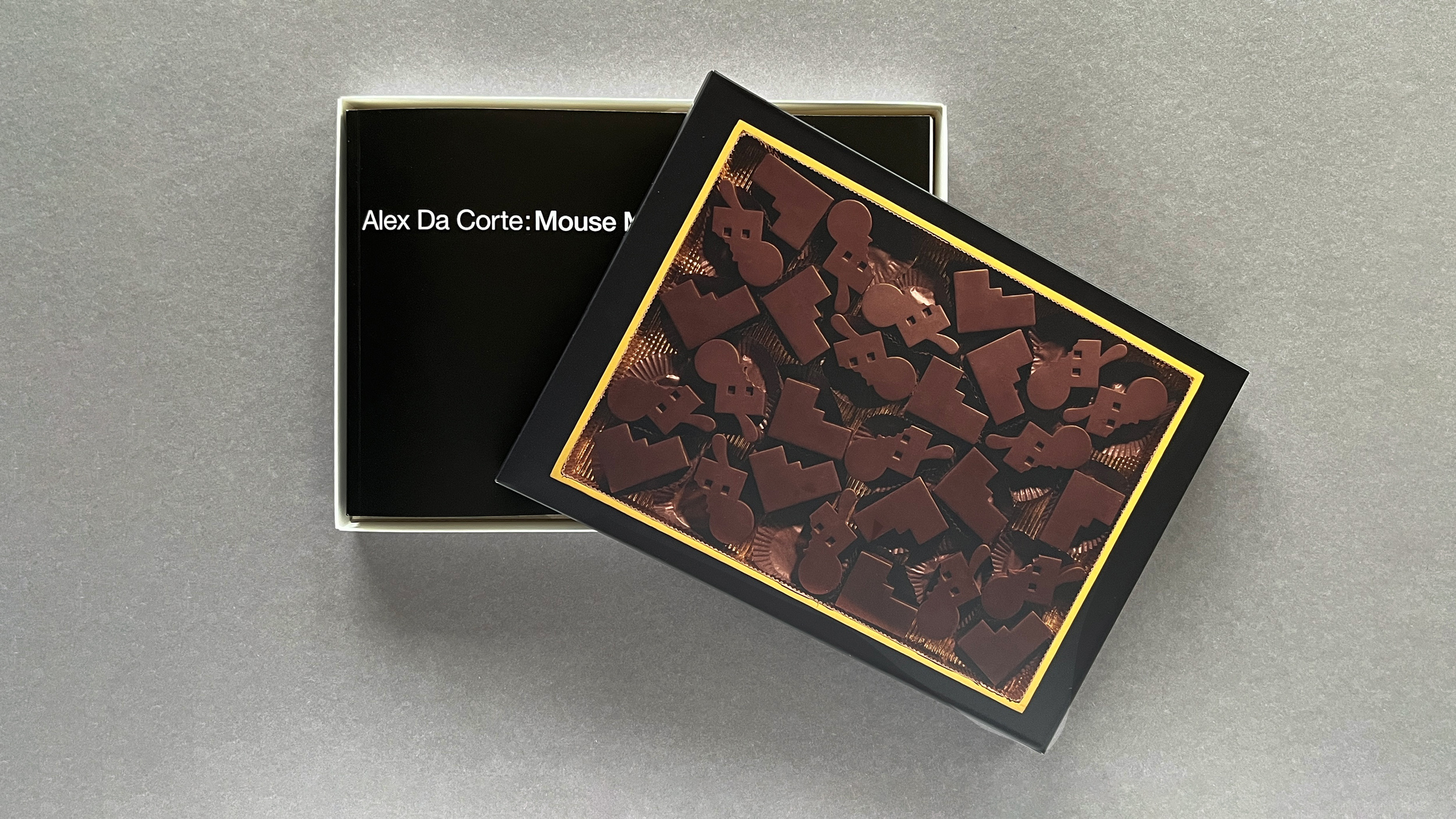
The original book, by Coosje van Bruggen and Claes Oldenburg, has become something of a collector’s item in art book circles. Our version needed to mirror its physical presence while containing Da Corte’s contemporary interpretation. This meant matching paper stocks, printing techniques, and binding methods – all while working across three languages (English, Danish, and Japanese) and two publishing institutions: the Louisiana Museum of Modern Art and the 21st Century Museum of Contemporary Art, Kanazawa.
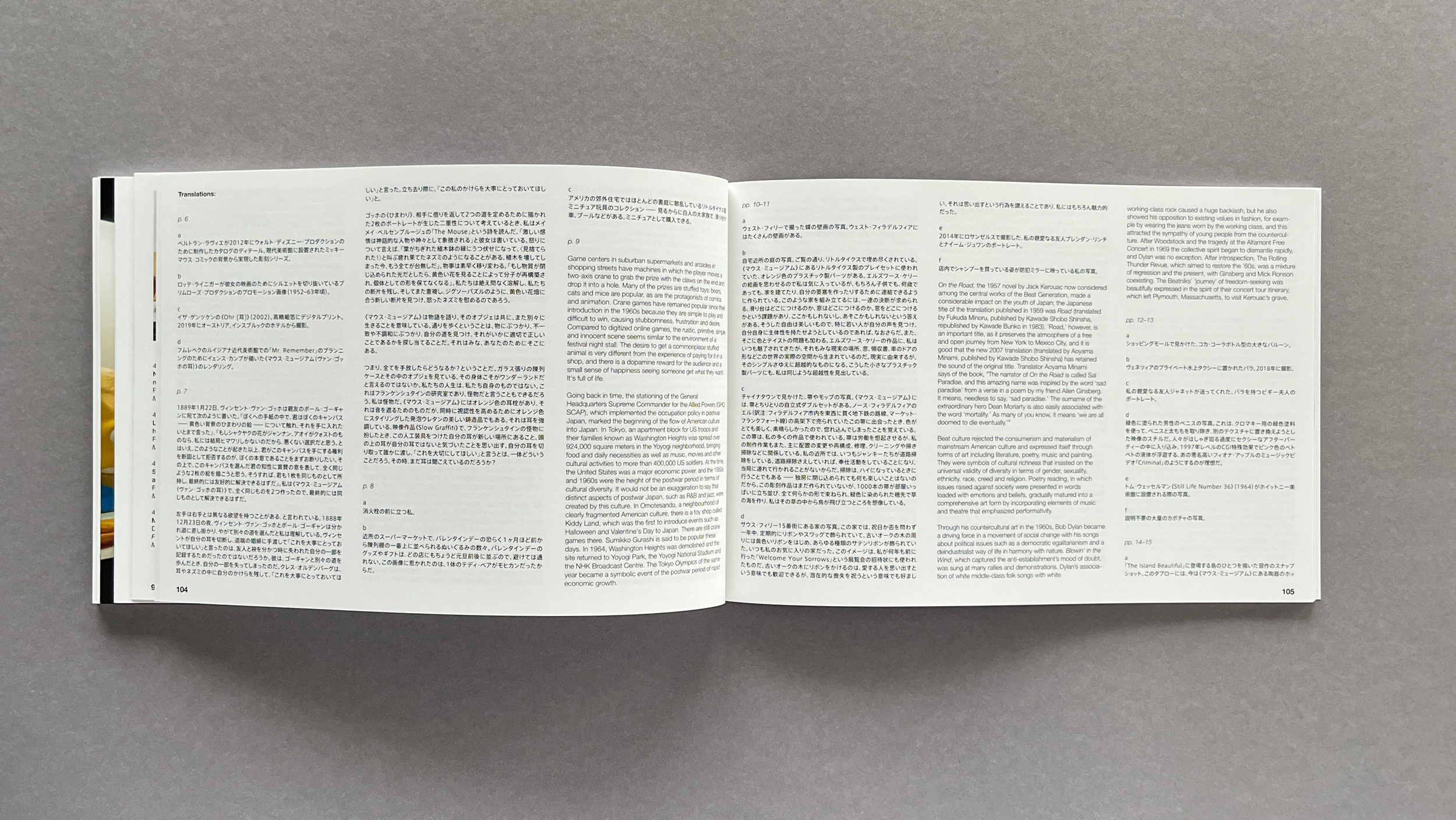
The process took two years, partly due to the complexity of coordinating between multiple museums, writers, and production teams across different continents. But this extended timeline allowed us to really dial in the details. We worked through countless samples of paper and binding options. The Japanese edition required an additional opaque silver spot layer to meet certain standards of propriety – a technical challenge that actually ended up adding an interesting dimension to the book’s materiality.
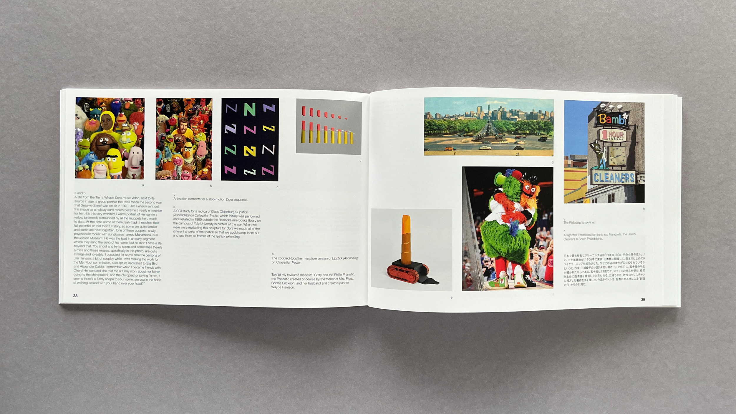
One of the most engaging aspects was working with the contributing writers: Arne Glimcher, Hiromi Kurosawa, Paulina Pobocha, and Mathias Ussing Seeberg. Their texts needed to work both independently and as part of the larger conceptual framework. The layout had to accommodate three different writing systems while maintaining the exact page count and structure of the original publication.
The Japanese text added another layer of complexity midway through the project. When the 21st Century Museum of Contemporary Art in Kanazawa came on board, we had to rethink our approach to the book’s structure. Working with Hiromi Kurosawa, the museum’s curator, meant not just translating content but reconsidering how Japanese typography and reading patterns would interact with our existing layout. The Japanese writing system demanded different spacing and different grid considerations. What could have been a major disruption turned into an opportunity to deepen the book’s conceptual framework – the additional text actually helped us better understand how the book could function across cultural contexts.
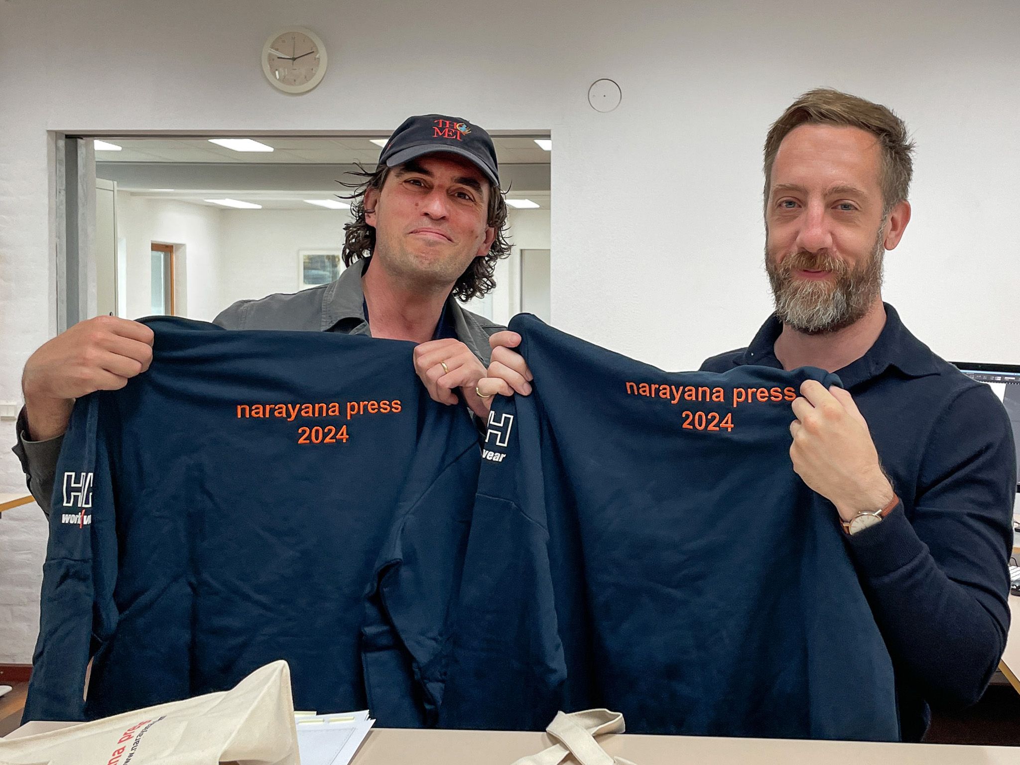
A crucial part of the production process involved working with Narayana Press in Denmark, a printer with an unusual history and exceptional attention to detail. Founded in 1955 in Rishikesh, Himalaya, by a philosopher-author named Swami Narayanananda, the press eventually established itself in Denmark, bringing with it a unique approach to printing that combines technical precision with an almost meditative dedication to craft. Their facility, tucked away in the Danish countryside, maintains this philosophical heritage while housing some of the most advanced printing technology available.
William and I took the train out to Narayana one fair weathered Danish morning. We received the kindest greeting from the monks, and our accommodations were furnished with clean Danish design and our fridge stocked with with butter and milk from the cows raised on the grounds of the printshop. Watching our sheets come off their presses, with the subtle variations the precise detail focused on the 5th Pantone color matching we needed, confirmed we’d made the right choice in printing partners. It’s rare to find a printer that approaches bookmaking as both a technical and spiritual practice.
Published in two editions of 300, the book exists as both a traditional exhibition catalog and an artist’s book – documentation of Da Corte’s sculpture and an artwork in its own right. This dual nature informed every design decision, from typography choices to production specifications.
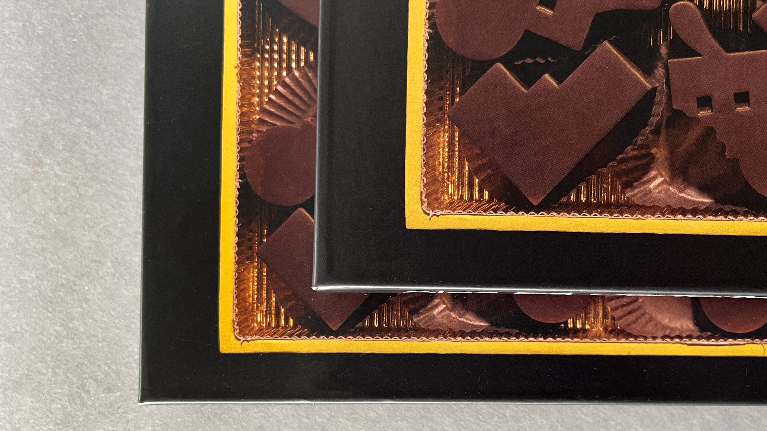
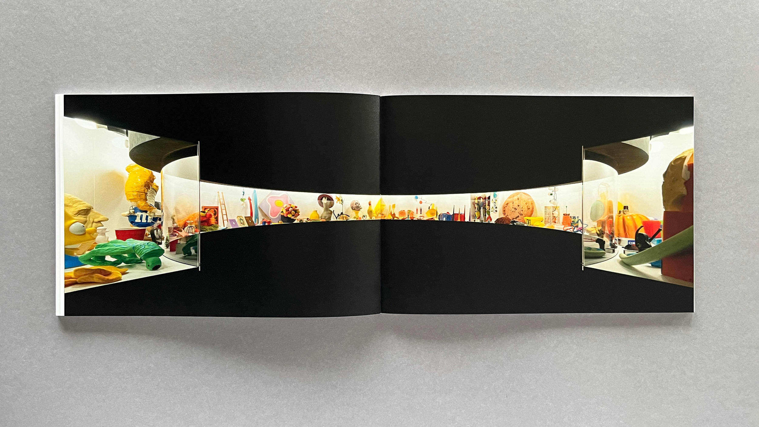
What I find most interesting about projects like this is how they challenge our assumptions about what a book can be. Is it a document? An artwork? A translation? In this case, it’s all of these things simultaneously. The book functions as a codex to Da Corte’s sculpture while also serving as an illustrated, first-person guide to an artist’s pathology.
For those interested in seeing the book in person, it’s currently available at MOCA Toronto, with exclusive US copies of the Japanese edition available at Ulises in Philadelphia and Karma bookstore in New York. Published by DAP.
This project reinforced something I’ve long believed about design: sometimes the most interesting solutions come from working within strict constraints. By exactly matching an existing book’s format while creating something entirely new, we had to be both precise and creative – a combination that often yields the most satisfying results.
You can see the more images of the book in my portfolio.
Also of Note
A Syllabus for Generalists
There was a time when erudition was deeply valued - when knowing about many different subjects wasn’t seen as superficial but essential. While “jack of all trades” carries a negative connotation today, the full text of the original quote (“Jack of all trades, master of none, though often times better than master of one.”) points to something quite different. For those interested in revisiting what high school attempted to teach us - subjects that seemed pointless largely due to their decontextualized presentation - there’s real value in reengaging with geometry, physics, chemistry, and literature. See the syllabus.
Until Next Time
Promised reports about London and some teaching I’m doing in Paris are coming early in 2025. Also one new visual identity project and a new website for Myleik - more about those as well.
As always, your support means a lot as I rebuild this connection with you. If you found value in this newsletter and want to encourage more, consider consider buying me a coffee. Cheers.